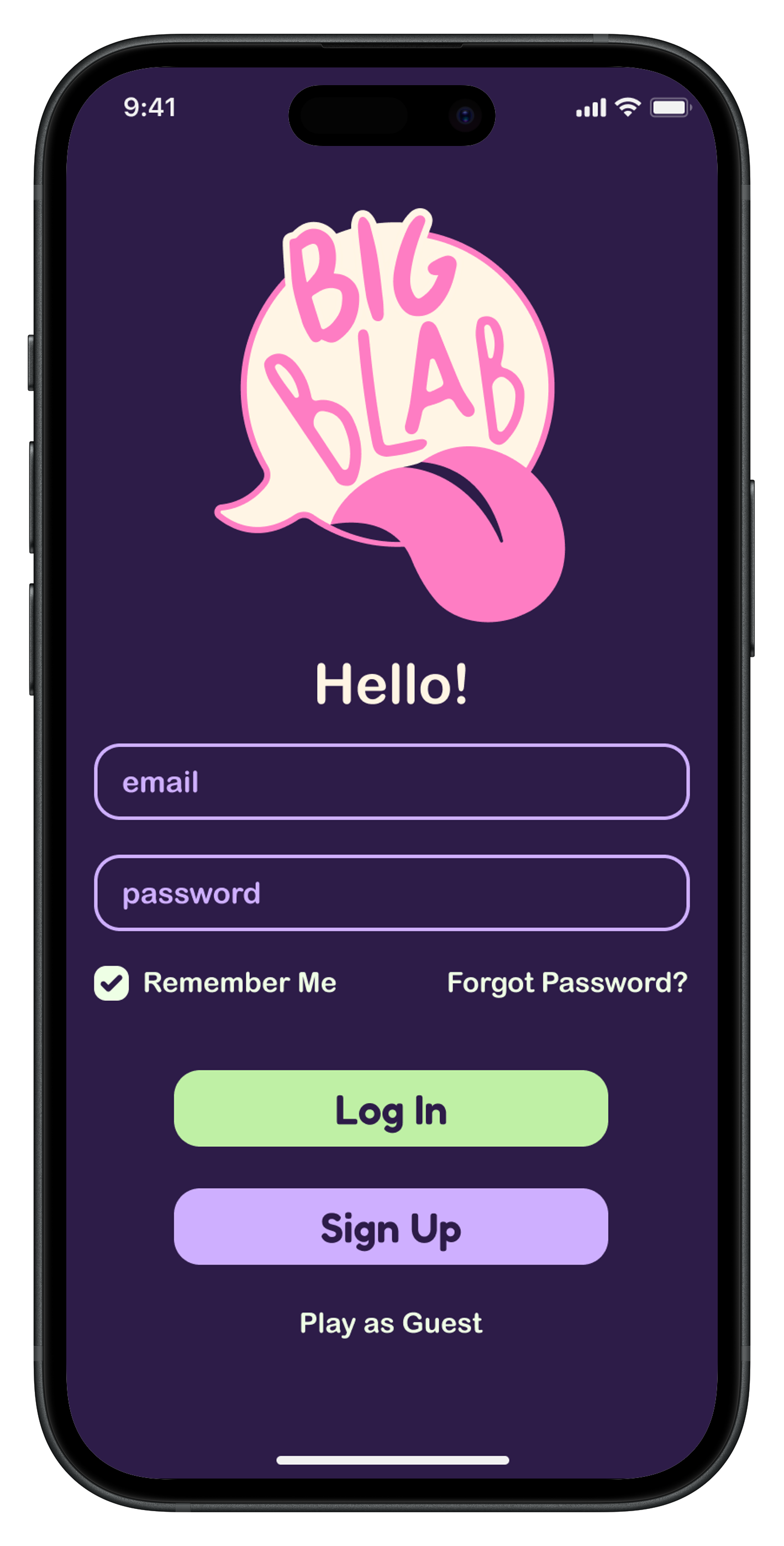
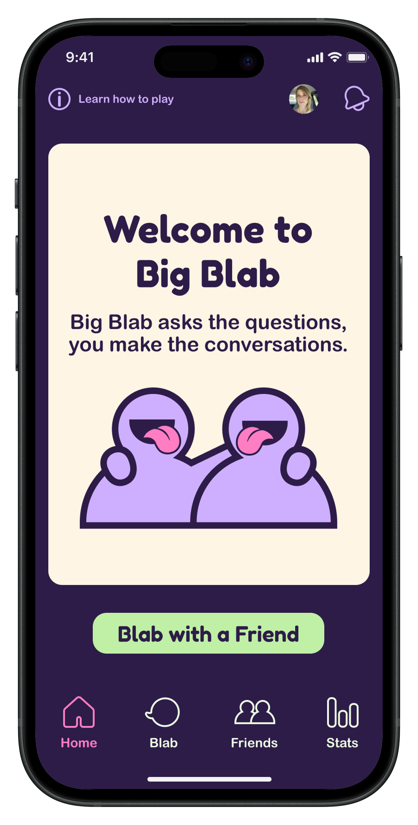
Big Blab
Big Blab is a fun app that helps break the ice without any pressure. It generates thought-provoking prompts so people can connect and maybe even learn something about their friends.
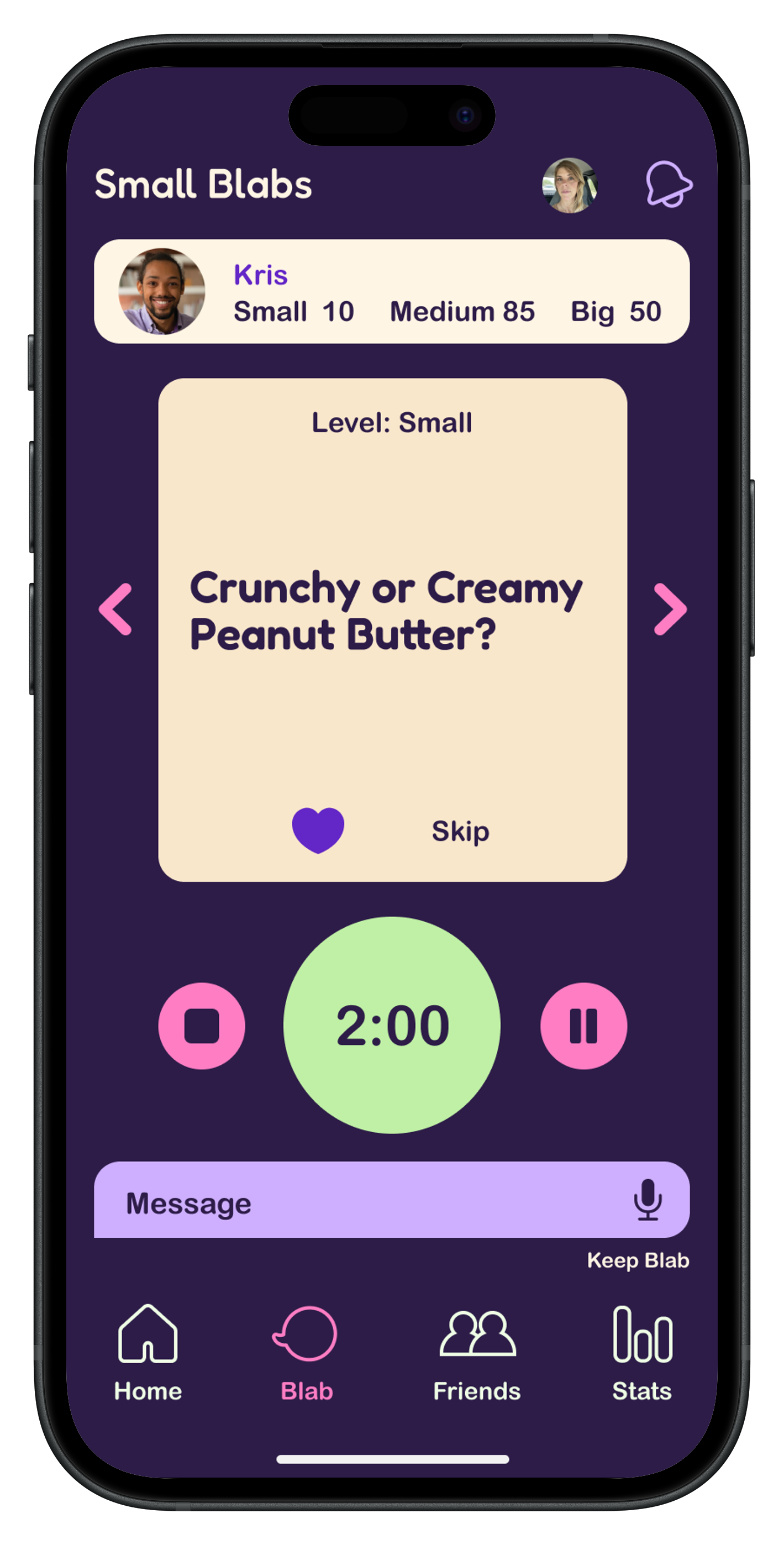
Instead of chatting in real time, friends swap quick two-minute voice messages whenever it fits their schedule. As the back-and-forth grows, so does the connection — one easy, playful conversation at a time.
Overview
• Role
UX Researcher, UX/UI Designer
• Process
Research, Ideation, Design, Testing, Prototype
• Tools
Miro, Figma, Illustrator
• Timeline
16 weeks
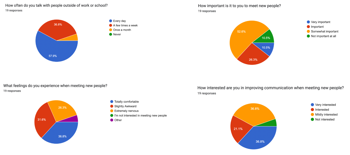
Using a social media screener survey, I interviewed five people who value genuine connection. Across the board, they shared similar struggles with meeting new people and staying authentic in conversations. Their reactions, however, varied — some approached interactions with openness, while others felt more anxious or unsure.
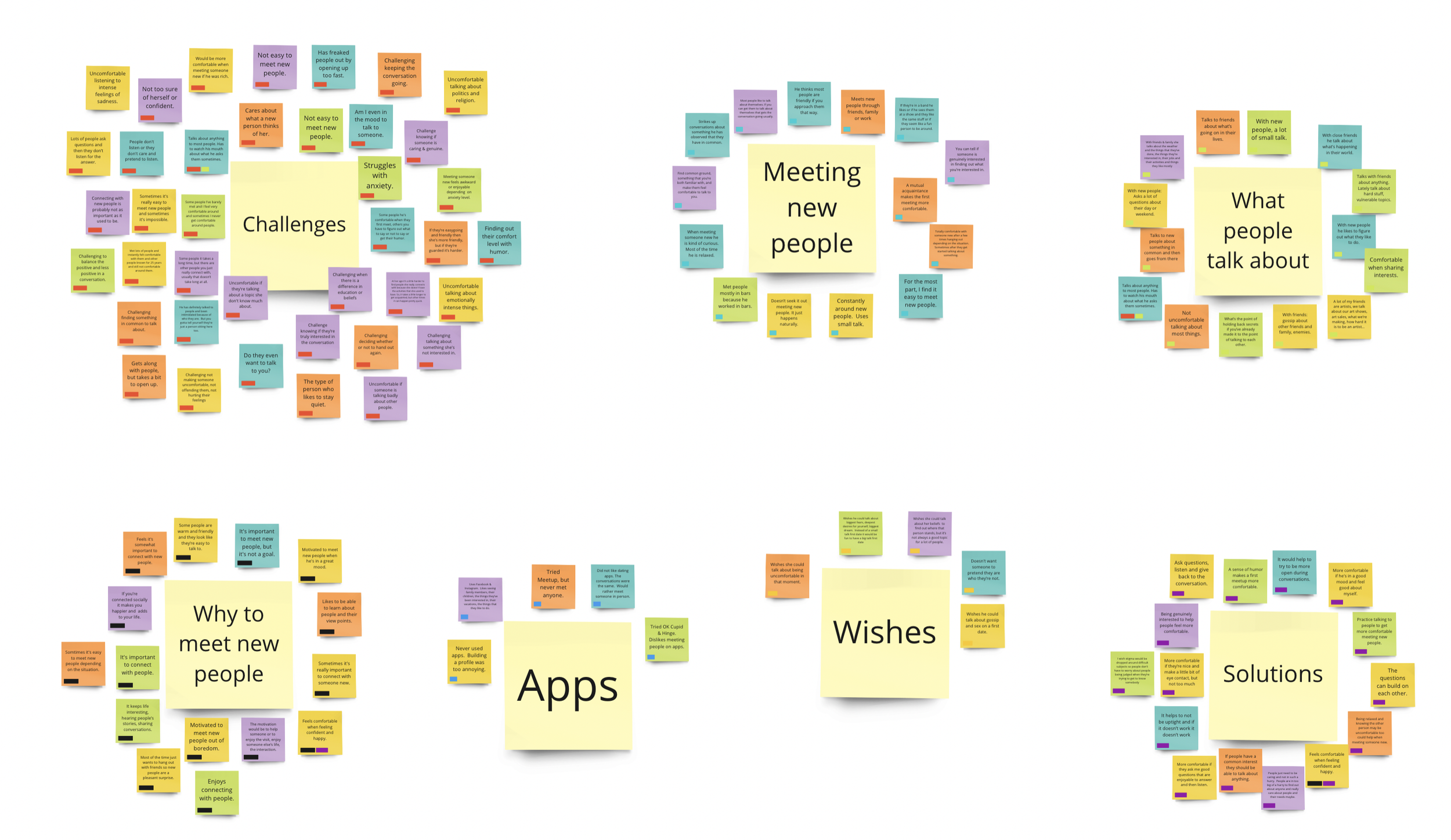
Organizing the interview insights revealed key conversation challenges. I grouped them into three areas:
• What people talk about
• How and why they meet new people
• Challenges, solutions, and wishes
The biggest pain points were feeling unheard, getting stuck in shallow small talk, and feeling uneasy during interactions.
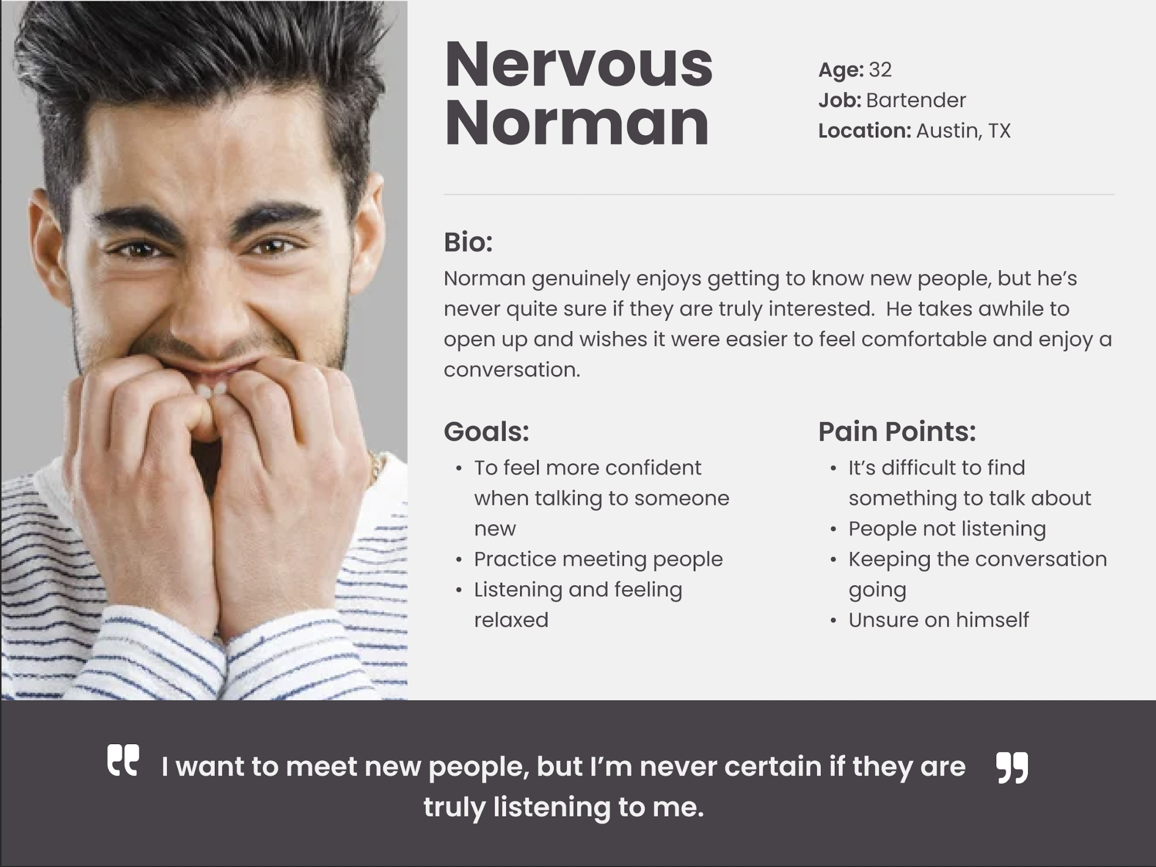
From the feedback, I created two user personas:
• A confident conversationalist looking for deeper, more meaningful interactions
• A nervous communicator who wants simple, low-pressure ways to engage
These personas helped ground the project in real user needs. They also inspired a lighthearted app design aimed at easing the anxiety that comes with meeting new people.

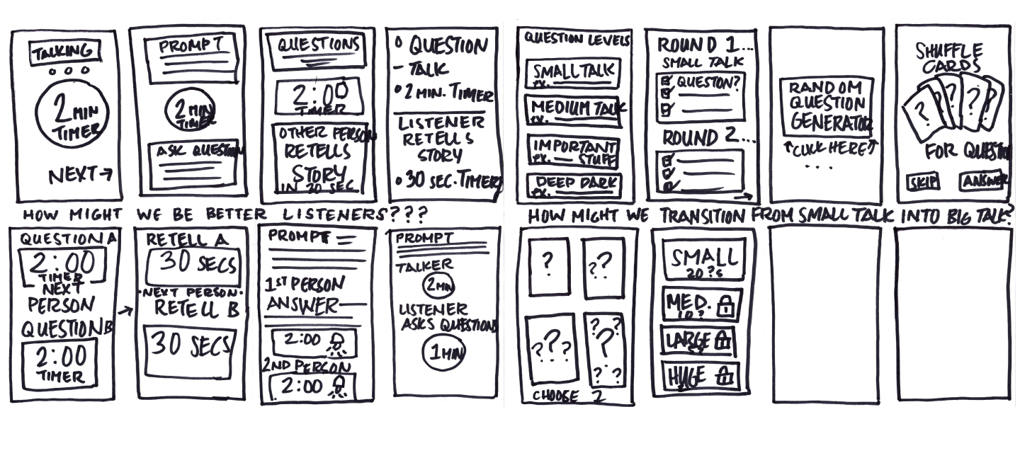
Once I understood the core challenges around conversation, I began sketching ideas to address them. This led to key “How might we…” questions that guided the design:
• How might we move beyond small talk into something more engaging?
• How might we find common ground and build from it?
• How might we become better listeners?
• How might we practice connecting so we feel more confident with new people?
• How might we slow down and better notice what the other person needs?
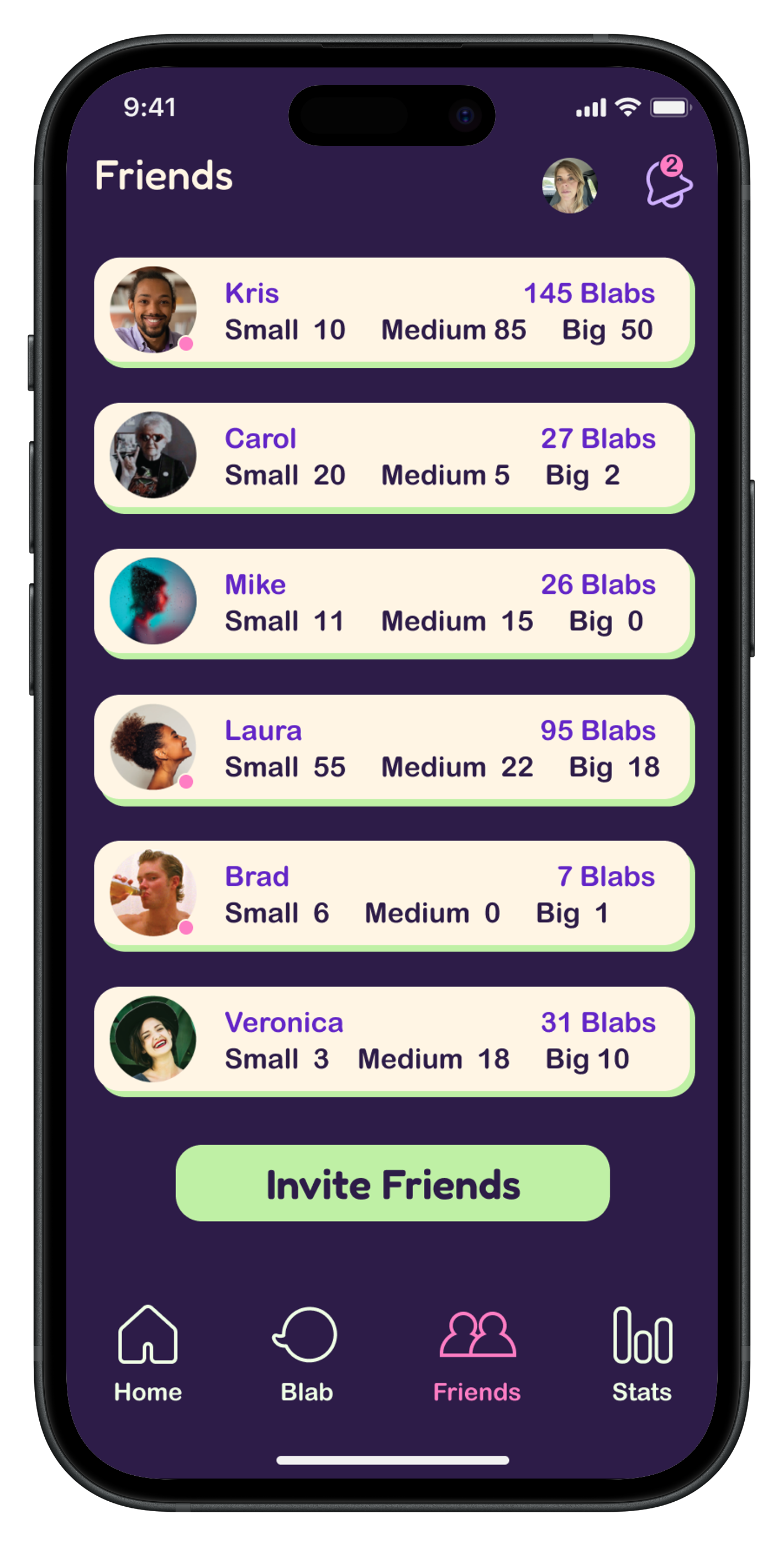
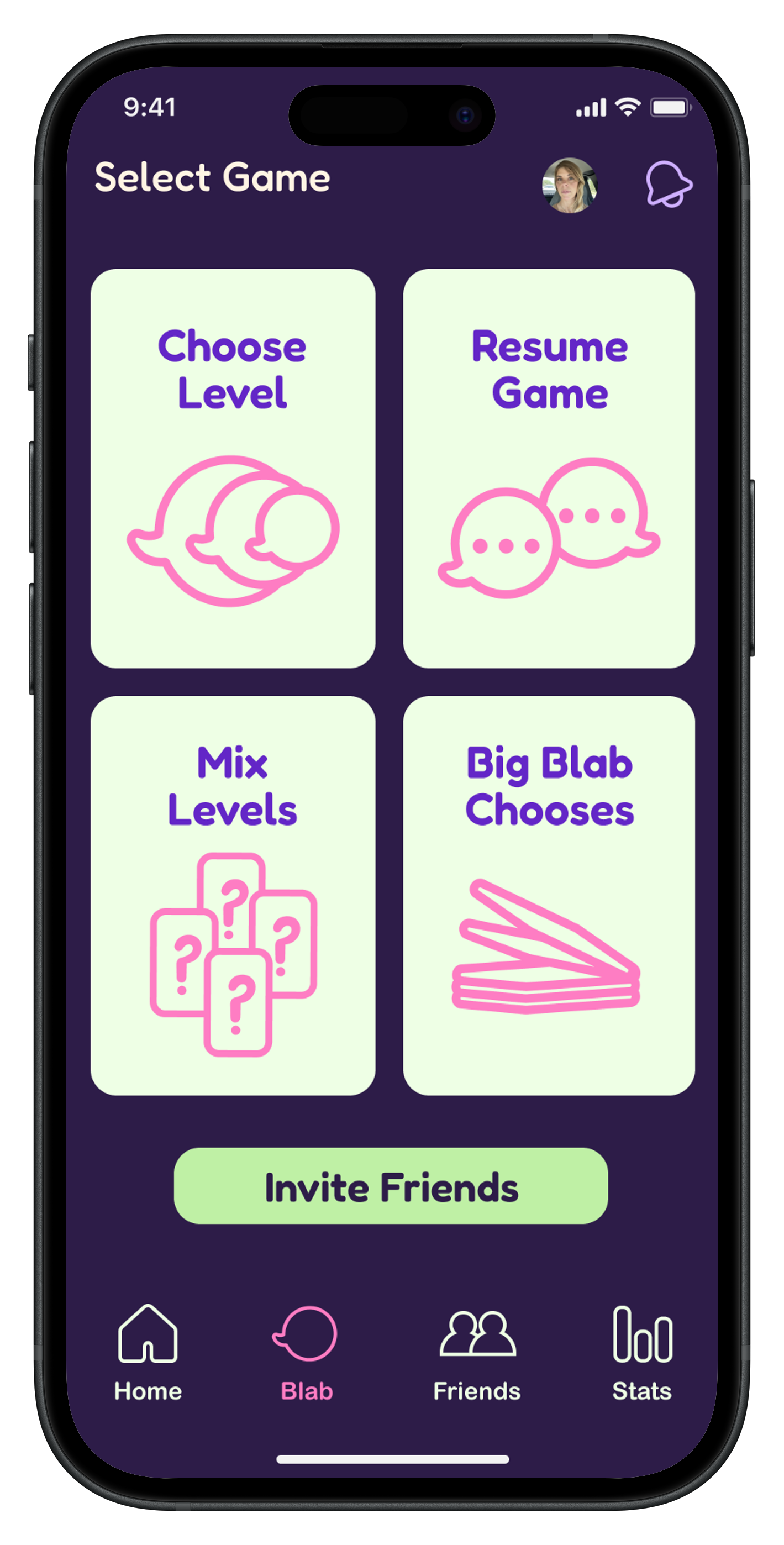
With the user’s needs in mind, I outlined key features and prioritized them:
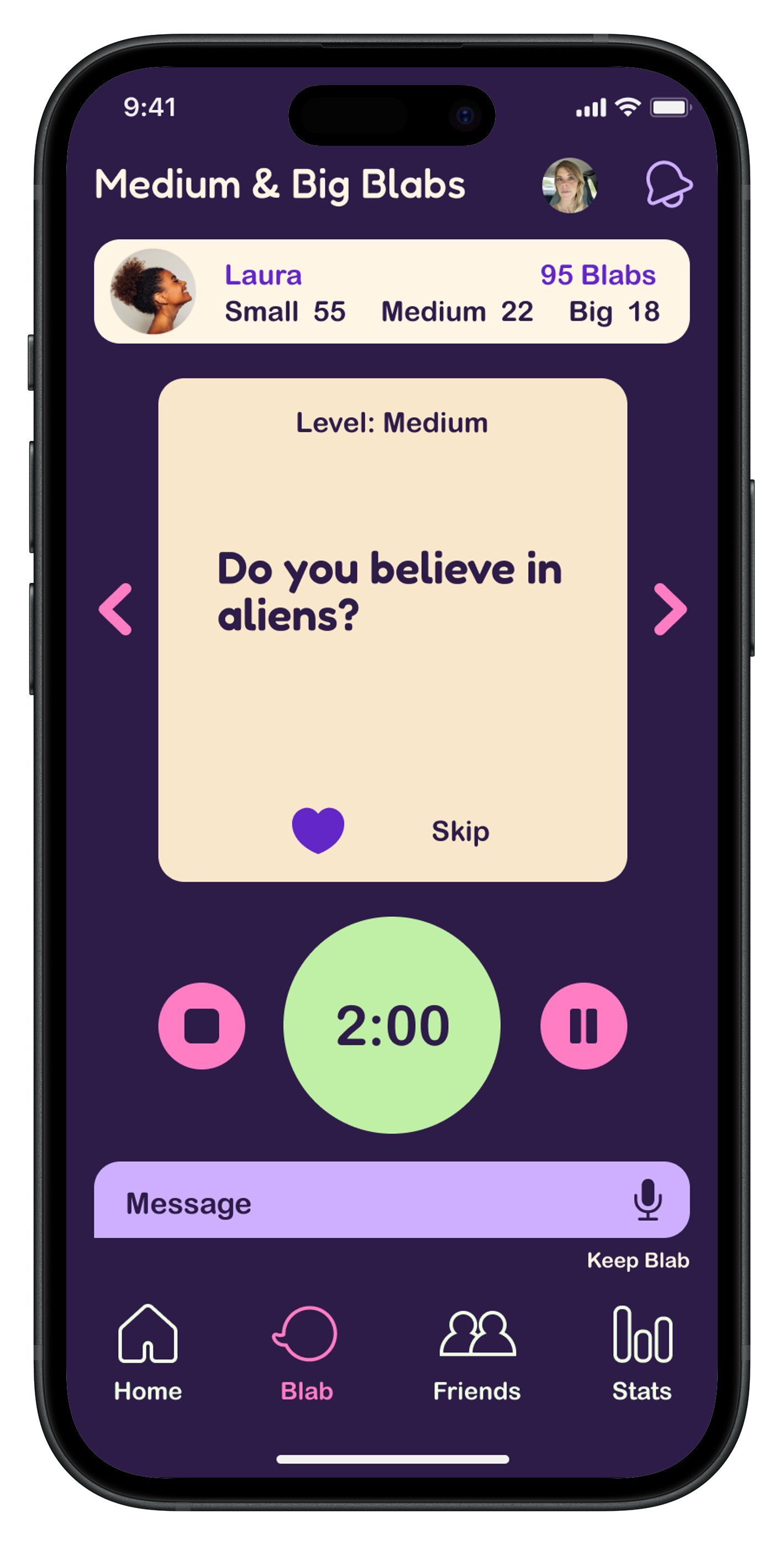
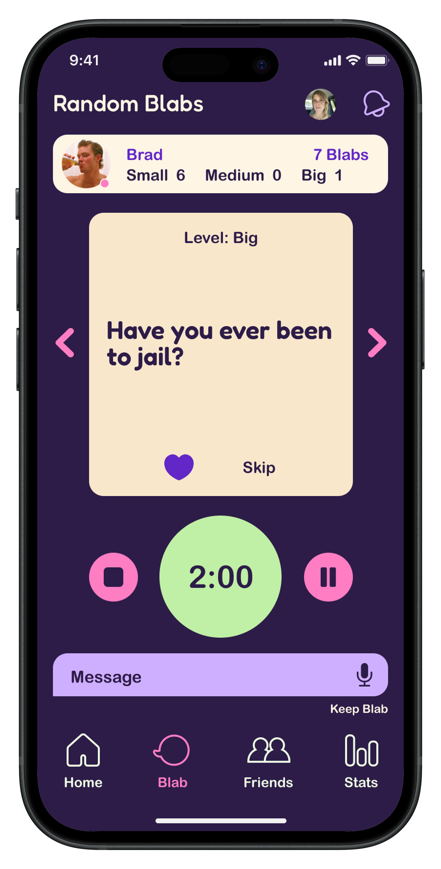
As a user, I want a timer so each person gets equal time to share.
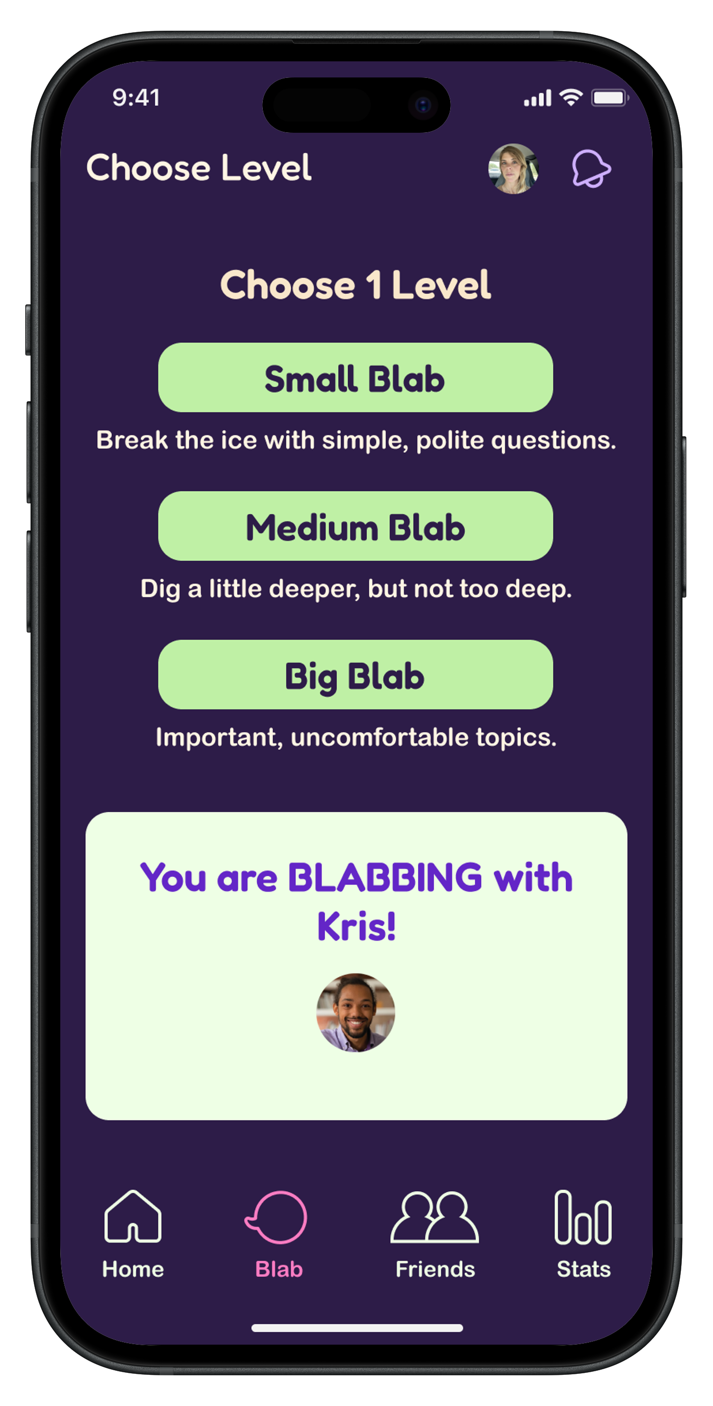
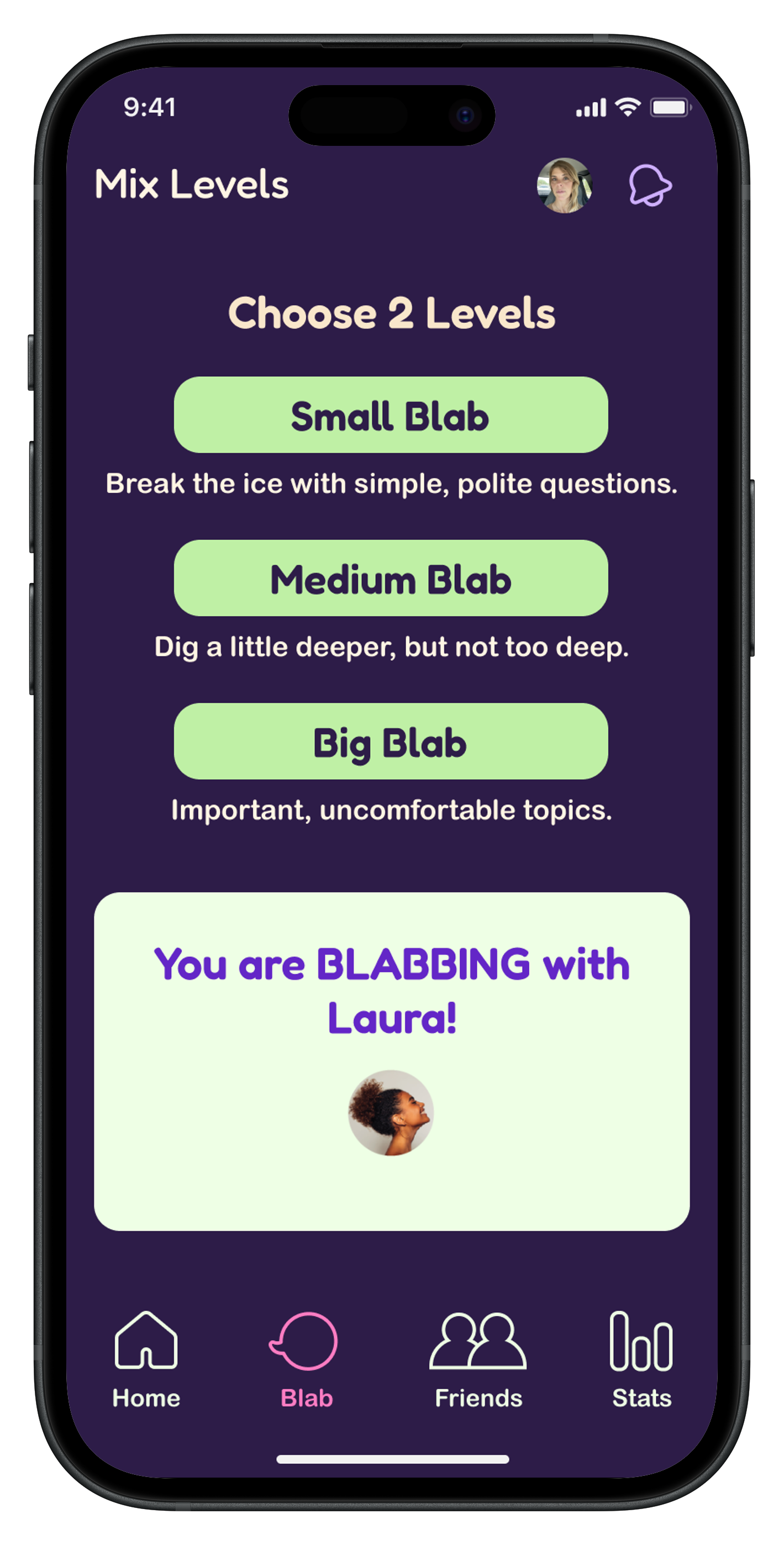
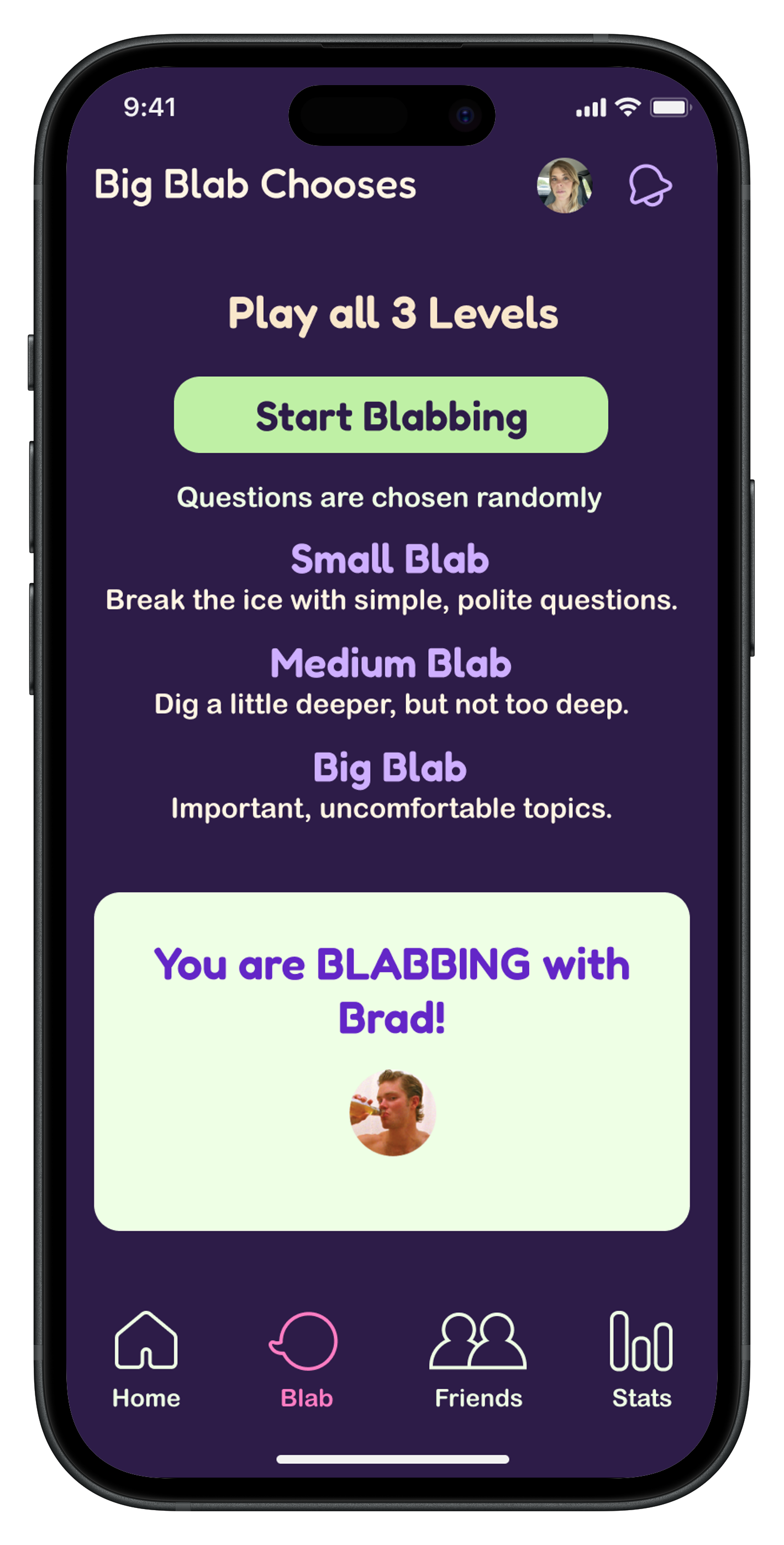
As a user, I want to choose question difficulty levels to guide the depth of conversation.
As a user, I want the option to respond with voice memos so I can play with someone online.
As a user, I want simple, engaging infographics so I don’t have to read lengthy instructions.
As a user, I want to save my game progress with each partner so I can pick up where we left off.
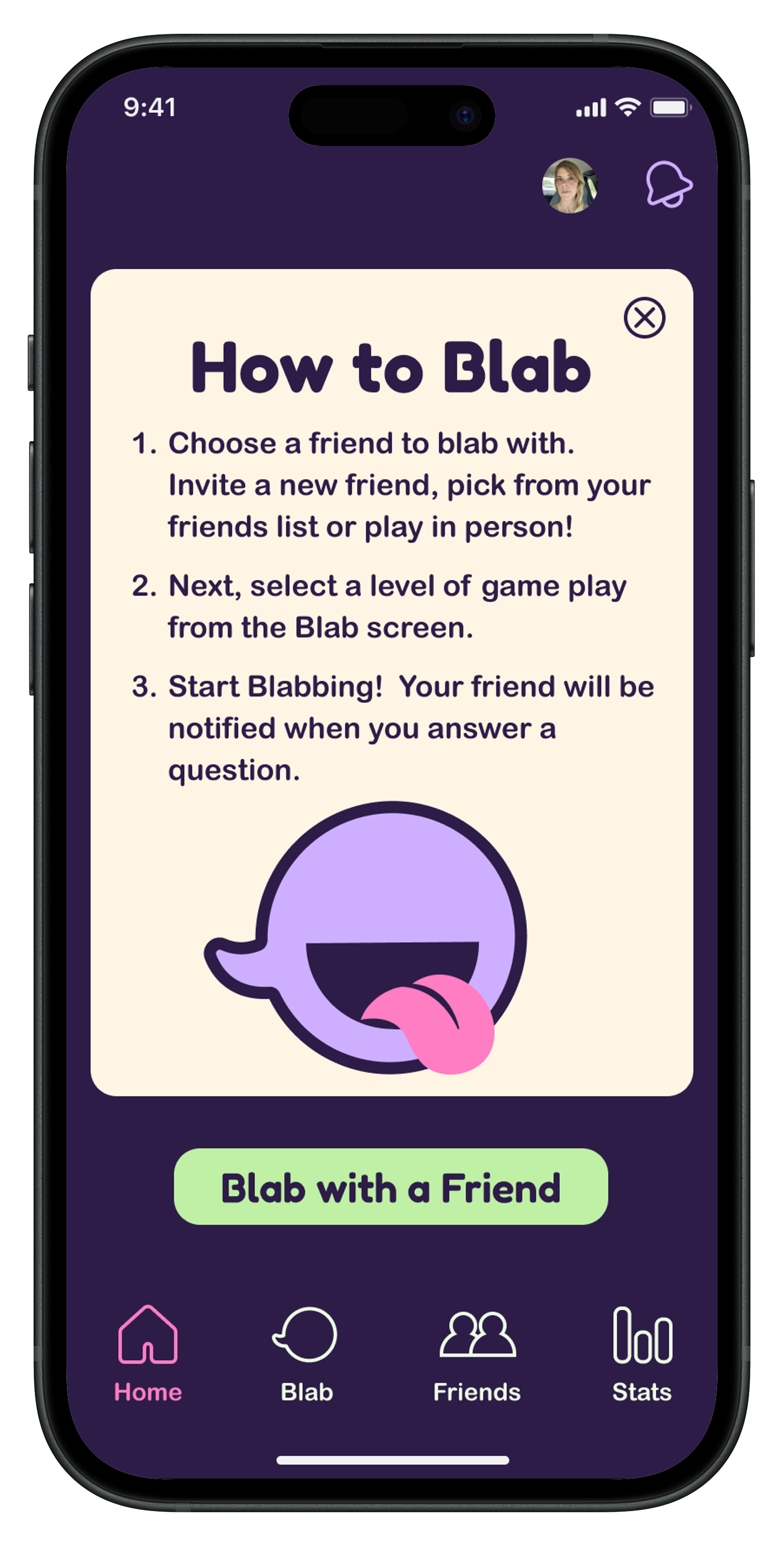
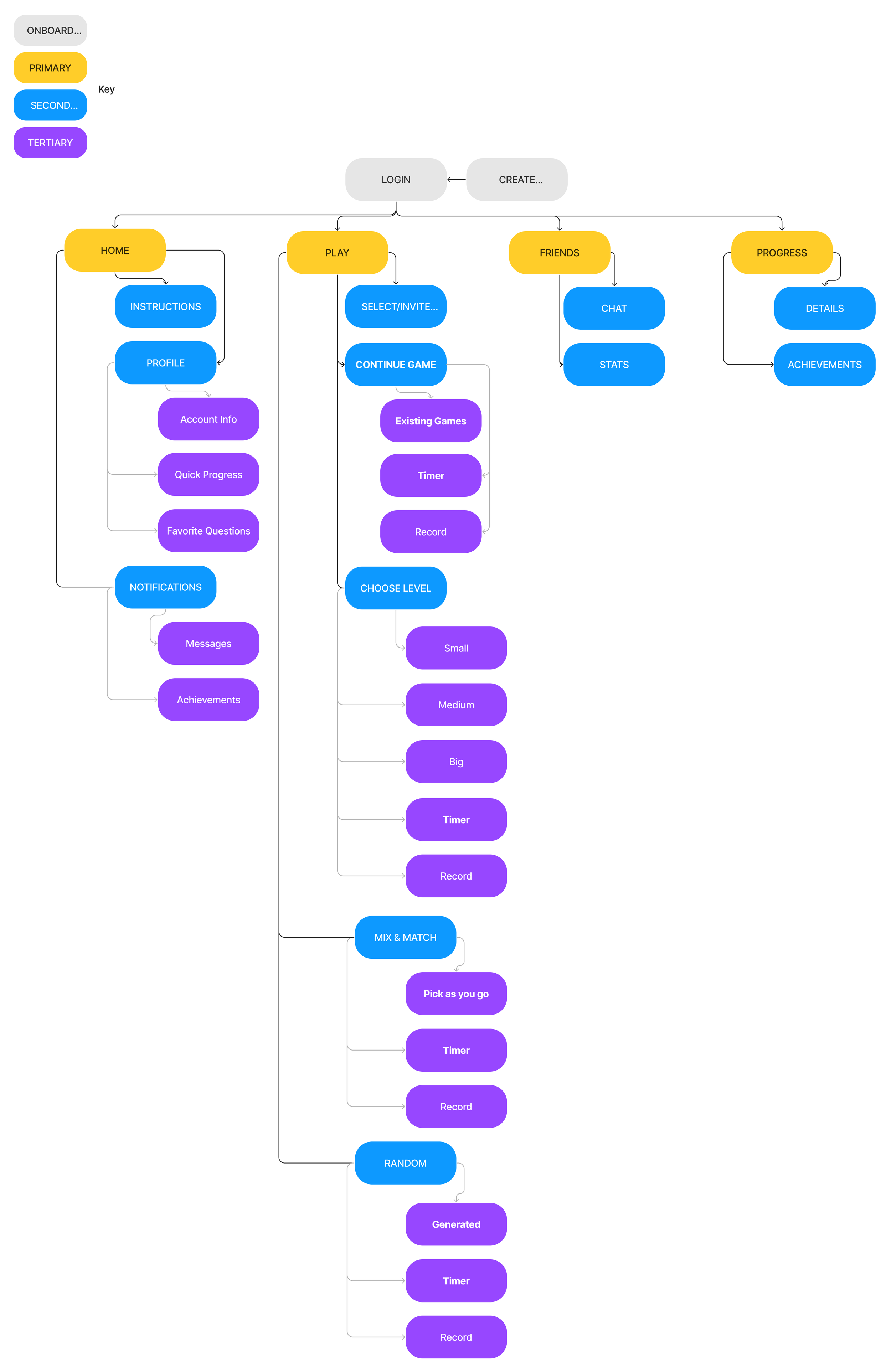
I created a site map to define the core features: a timer, voice recordings, adjustable question levels (from casual to deeper topics), and a game history to review previous exchanges. This visual outline became a key reference throughout the project.
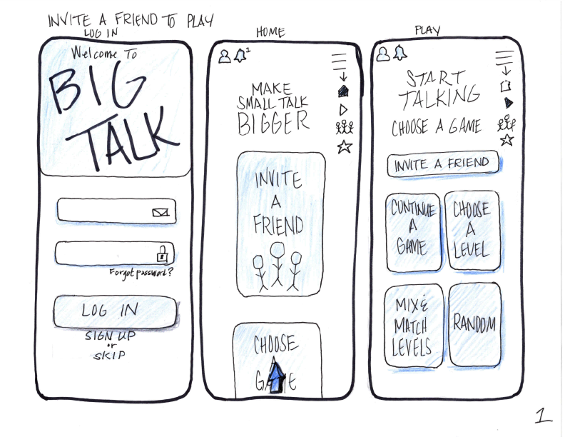
Putting the app on paper was the first step in turning the research into something real. These early sketches shaped the overall look, feel, and flow of the product.
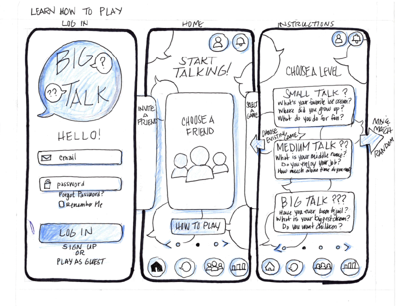
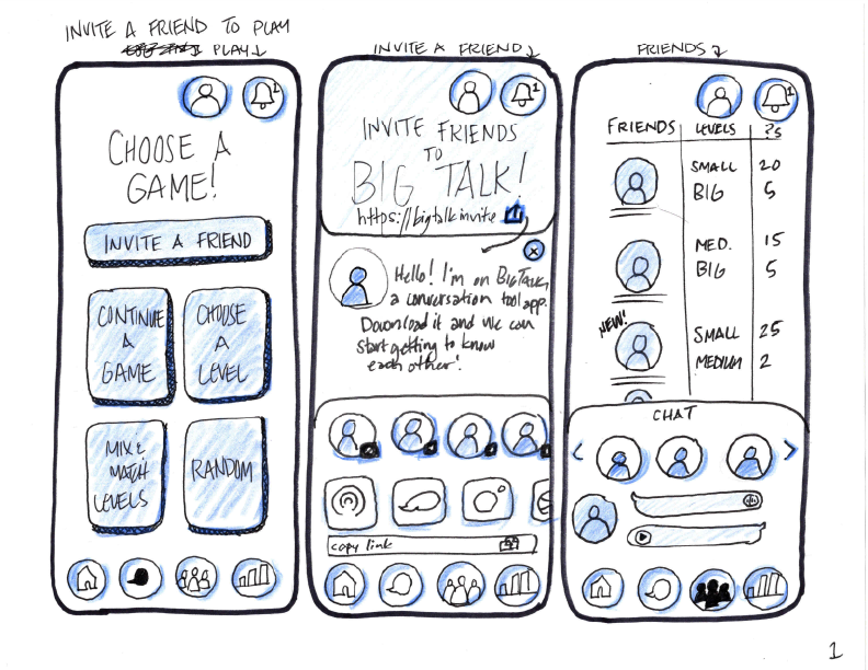
Creating Lo-Fi wireframes in Figma helped refine the user experience, tighten screen layouts and spacing, introduce carousels for game previews, and explore additional visual directions that would guide the final design.
I created a mood board to define the app’s overall attitude and energy. It helped me explore visual styles, color palettes, and textures that would shape the brand’s personality. By establishing a lighthearted, slightly offbeat feel, the mood board guided the app’s design choices and ensured the brand would feel approachable, playful, and inviting to users.
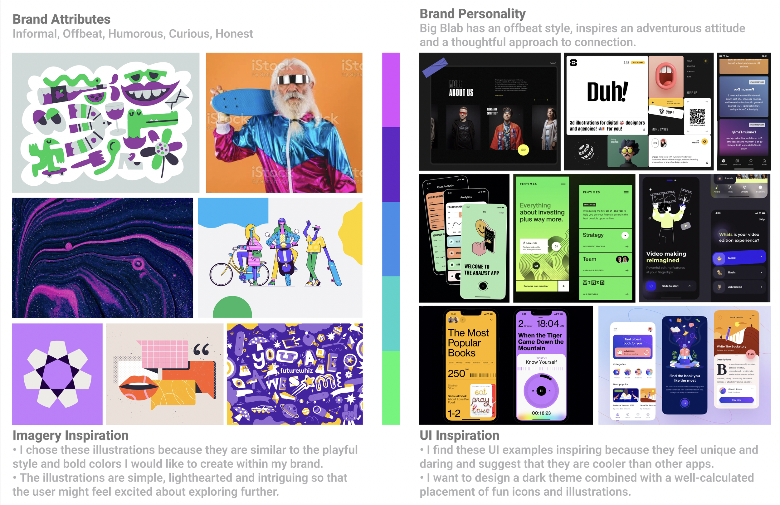
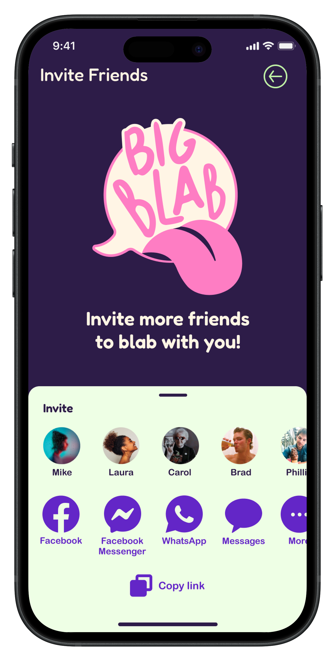
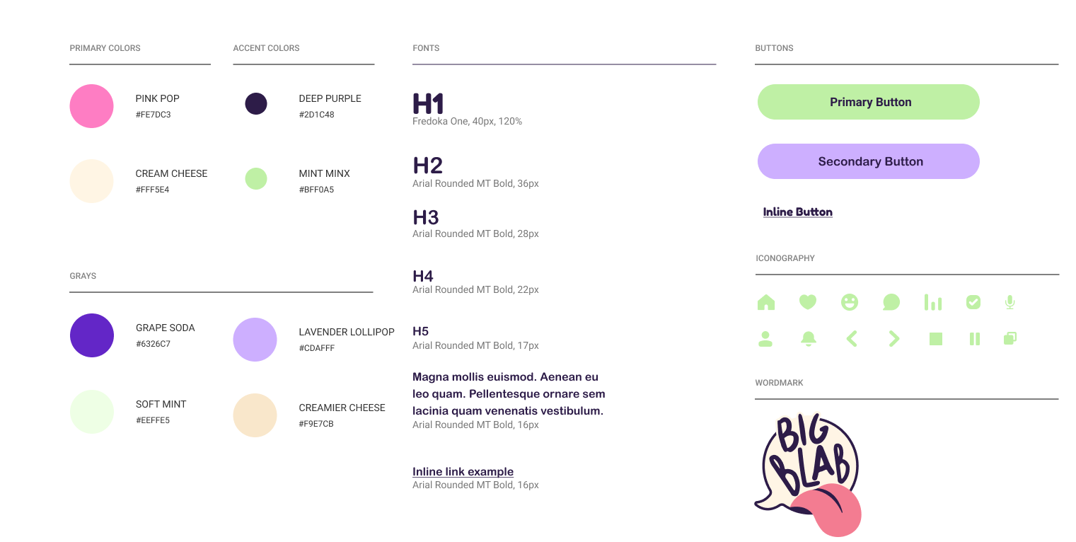
The mood board informed Big Blab’s color palette, logo, and overall personality. I chose a bold, readable font and vibrant, unconventional colors to set the app apart from typical question games. The style guide ensured design consistency and helped create a cohesive, engaging user experience.
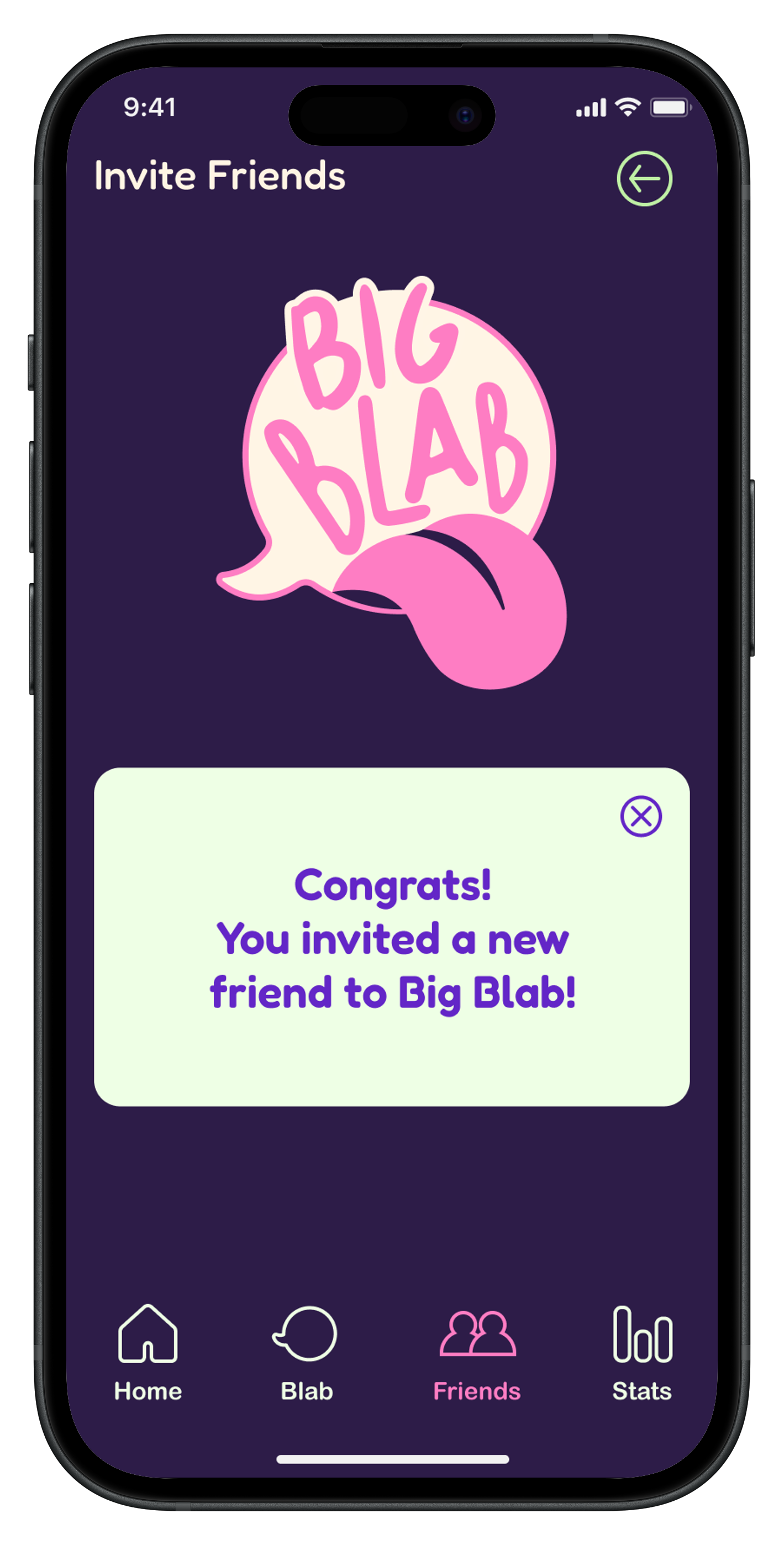
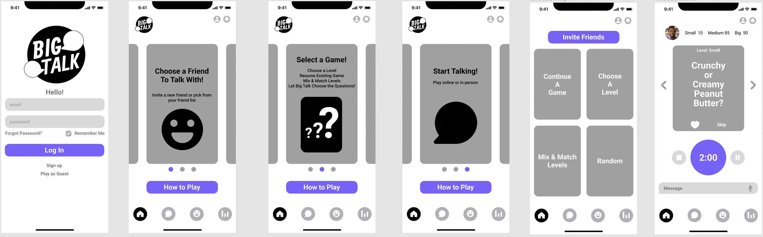
Building on the style guide and mood board, I refined the Hi-Fi screens by updating illustrations and icons, adjusting text and icon sizes, improving visual hierarchy for Call-to-Action buttons, and addressing color contrast for accessibility — all to create a smoother, more user-friendly experience.